[av_hr class=’custom’ height=’50’ shadow=’no-shadow’ position=’center’ custom_border=’av-border-fat’ custom_width=’100%’ custom_border_color=’#1f4e78′ custom_margin_top=’30px’ custom_margin_bottom=’30px’ icon_select=’no’ custom_icon_color=” icon=’ue808′ font=’entypo-fontello’ admin_preview_bg=”]
Dana Lyons lives and works as a user interface designer in Pittsburgh, PA. Using language, vector graphics, and vibrant colors, her work often explores the intersection of ethical design, technology, and human behavior.
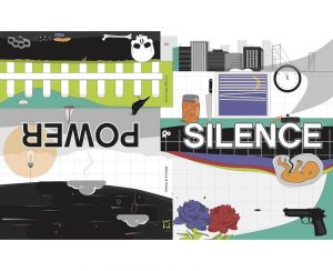
Lyons received her MFA in Graphic Design from Vermont College of Fine Arts in 2018, and she was recently awarded the Hunger Mountain Design Fellowship to design the fabulous look and layout of Hunger Mountain Issue #23: Silence & Power.
What follows is a conversation about the inspiration and development of her signature design style, as well as Lyons’s fascination with how smart technology affects the human brain.

CF: Let’s start from the beginning! What were some of your passions when you were a child? What did you want to be “when you grew up”?
DL: My first love was dance. Ballet was always my favorite. I always claimed to want to be a prima ballerina when I grew up, but as I got older, I realized that dancing to make money would take the love out of it for me.
I danced for fifteen years, and when it came time to choose a major for undergrad, I settled on double majoring in communication and dance. I ended up dropping dance after the first week and started taking yoga classes at the gym. Getting graded on something that had always been a passion sounded miserable to me. Moving my body has become a crucial part of my creative practice, but it’s more about self-love now than performances.
You are an alum of the MFA in Graphic Design here at VCFA. What was life as a VCFA student like for you?
I knew that I could easily hide behind a computer screen to complete a Graphic Design MFA, but something about low-residency sounded thrilling to me — especially as an introvert. Somewhere between my first residency and my last, the people around me became my family. If I had to describe VCFA’s Graphic Design MFA program in one word, I think it would have to be healing. I had so many preconceptions coming in to the program about what design was. The VCFA experience has this way of challenging everything you think you know to be true. I made things, wrote things, and designed some things, but ultimately, I think being a student in the design program changed (for the better) the way I see the world, design, and myself. 

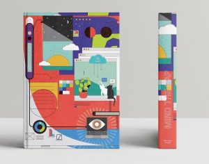
I don’t think we at Hunger Mountain will ever be able to tell you just how much we love your design of our newest issue, “Silence & Power.” The cover is your original design and resembles the technicolor graphic cover you created for your graduate thesis. How did you develop your “signature” style?
You’re so sweet! It has been such a pleasure.
I’ve always been pretty savvy in Illustrator, but I never truly explored this illustrative approach until my thesis semester. I’m an Interface Designer professionally, so I work with iconography and vector graphics quite frequently. Book design has never really been my forte, but I knew I wanted to try to design something that commanded attention for the cover. There is some commentary on “The Attention Economy” in the book, so it just felt right.
In my thesis, I explored the gap between “The World of Things” (the material world) and “The World of Ideas,” (the internet/digital space). Virginia Heffernan writes of these worlds in her book Magic and Loss: The Internet as Art which really had an impact on me in my research. Ultimately, I decided to design a cover that might represent this space for me graphically, inclusive of my pet cats and houseplants! This similar approach seemed appropriate for “Silence & Power” because it became a channel for stories from each side of the double-sided journal to intersect. I would definitely love to do more work in this style if the opportunity presents itself.
Do you have a particular approach as you begin a project?
I tend to mind-dump. The notebook that I carry with me totally looks like the scribbles of a madman. I like to make mind maps, lists, and sketches until I find connections that can become larger projects.
As an emerging artist myself, I have to ask, have you ever found it difficult to sustain yourself? How do you support your physical self and your creativity?
Oh, absolutely. Sometimes when I’m working, I forget I have a body. I think the way I treated myself as a student has helped to teach me what not to do in order to sustain a practice.
I mentioned earlier that moving my body is really important to my creative practice: walks, hikes, yoga, HIIT, or even just stretching helps to reconnect the mind and body. I feel less anxious and have a much easier time channeling ideas and shaking self-doubt.
I also like to set alarms so that I have disruptions that remind me to take a break. Alternatively, I normally keep my phone on do not disturb (and sometimes in a drawer a few rooms away) to shut off unwanted disruptions that will keep me from getting into a flow.
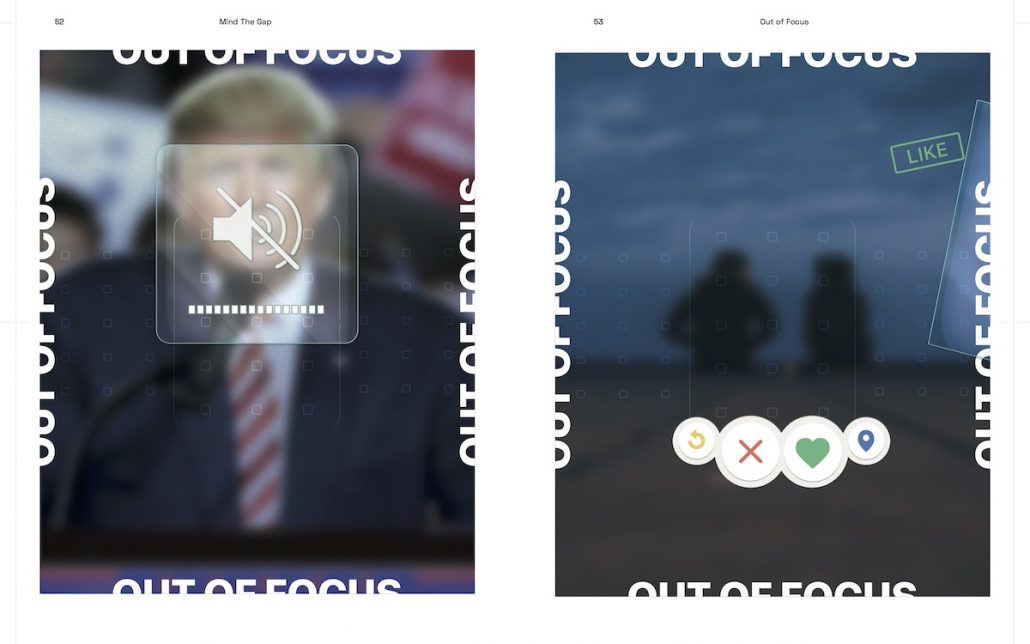
Your graduate thesis, entitled Mind the Gap, uses design as a lens to consider your concerns regarding human connection and agency in the digital age. Can you tell us a bit about what drew you to this topic? Did anything surprise you in your research?
I think it was while I was studying communication in undergrad that I really started to understand and acknowledge the shift that was happening in interpersonal communication, especially among my own age group. At that same time, I was also studying web design and, at that point, responsive design was in its infancy. Responsive design is the use of flexible grids so that a design can properly respond for many viewports, particularly mobile screens. As someone who designs digital products, I’ve always felt a responsibility to understand the ethics behind what I am designing. It is very common to copy design patterns in my field. For example, if I were to work on a banking app, I would study the way other banking apps function in order to work on my task at hand.

I think the most shocking idea I came across in my research is that design patterns, like device notifications and social media mechanisms such as “likes” and “follows,” all tap into our brain’s reward system and exploit psychological vulnerabilities. I became fascinated by this concept that interfaces have become an extension of the world around us. My thesis challenges designers to think about the way we are designing products and patterns, and to acknowledge these patterns as design objects to be critiqued. It is a topic that is relevant to designers but also affects anyone that uses digital products on smartphones, which is now over two-thirds of the world’s population.
On a related note, where do you go to nurture your creativity and escape from the compulsive pull of social media and the Internet? How do you “unplug” from an art form that demands so much time on the computer?
I love to fall back on meditative activities. Some of my favorites are embroidery, macramé, bullet journaling, and playing with India ink. Really anything that keeps my hands busy and lets my mind wander.

Why do you think this form of artistic expression suits you?
It’s great to be able to express myself both digitally and with my hands. When it comes to any of these practices, there is always something new to learn and problems to solve. There are always patterns to follow and new patterns to create.
What inspires you?
Part of the beauty of the internet is to be able to follow such an eclectic variety of inspiring people! I definitely draw inspiration from all of the faculty and students in the VCFA Graphic Design program still. Some of my long term go-tos have been the Note to Self podcast, the Almost 30 podcast, the words of Brené Brown and Alan Watts, and the design communities and thought leaders on Medium and Sidebar.io.
[av_hr class=’custom’ height=’50’ shadow=’no-shadow’ position=’center’ custom_border=’av-border-fat’ custom_width=’100%’ custom_border_color=’#1f4e78′ custom_margin_top=’30px’ custom_margin_bottom=’30px’ icon_select=’no’ custom_icon_color=” icon=’ue808′ font=’entypo-fontello’ admin_preview_bg=”]
[av_one_half first] [/av_one_half]
[av_one_half]Cameron Finch is a cross-genre writer and editor. She is a recent MFA in Writing & Publishing graduate from VCFA, where she served as Managing Editor of Hunger Mountain. Her creative work and artist interviews can be found in Entropy, Windmill, Glass Poetry, Queen Mob’s Teahouse, Michigan Quarterly Review, BUST, Midwestern Gothic, My Modern Met, and Artscope, among others. Find out more about her at ccfinch.com or on Twitter @_ccfinch_. [/av_one_half]
[av_hr class=’custom’ height=’50’ shadow=’no-shadow’ position=’center’ custom_border=’av-border-fat’ custom_width=’100%’ custom_border_color=’#1f4e78′ custom_margin_top=’30px’ custom_margin_bottom=’30px’ icon_select=’no’ custom_icon_color=” icon=’ue808′ font=’entypo-fontello’ admin_preview_bg=”]bridge media | GOLF NIKE SHOES
